1st Element of Art: Form
Form is concerned with the parts of a painting that deal with its physical construction, the colour, composition and the medium used (oil colour, acrylic, watercolour etc.), and perhaps the size of an object. These elements appeal to our senses, e.g. colour, but they do not have specific meaning the way words do. These elements of form are the basic building blocks that make up a work of art.
To understand form let’s look at some of the elements of form and how we interact with them.
Line
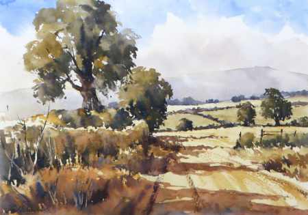
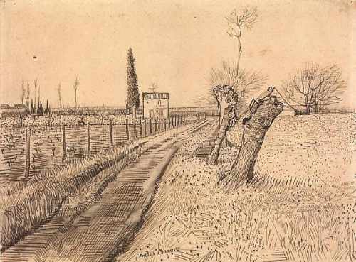
We all know what a line looks like; it can look very boring, but used sensitively can be very expressive. A line can be sharp and aggressive. It can be soft and sensuous, thick or thin. As it is drawn, a line can vary in thickness, which can give the line or object it defines, a certain tension. It can also imply direction to help take our eye on a journey around the painting. Line can also imply two or three dimensions depending how it is used. If we look at the drawings of Van Gogh, Raphael or Ingres we can see how great artists can use line to give a sketch a life of its own.
Line can be used as pattern, where a unit or motif is repeated or echoed in a design. Stripes have a strong pattern quality and superimposing one pattern on another can create very complex designs.
Colour
Colours have powerful associations and can even affect the way we feel. Black has is often associated with death, whereas red is often associated with passion, anger or danger.
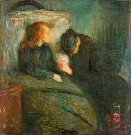
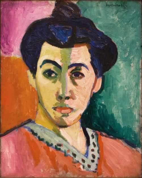
Artists often use particular combinations of colours to create dramatic effects. The red / green combination is a popular one. Red and green are complimentary colours and create intense colour sensations when used together. Edvard Munch used this colour scheme for his painting, The Sick Child 1907 to intensify the feelings in the viewer of the death of his sister. Claude Monet used the same colour combination, for a quite different purpose, in his painting, Poppies 1873. Here spots of red (poppies) float on waves of green to create the sensation of poppies in a field on a hot summer’s day. We also see the use of strong complimentary colours being used by Matisse in his Fauve painting, Green Stripe, again to create a dramatic and vibrant effect.
Colour can also be used to create a sense of space in a painting. In general terms cool colours tend to recede and warm colours come forward creating a sense of depth. However, all this is relative. It is the relationship between colours that create spatial effects. A colour can seem to recede when placed against particular colour, but advance when placed next to another. This method of creating the illusion of depth, or recession, in a painting or drawing by modulating colour to simulate changes effected by the atmosphere, was used by Paul Cézanne and others. It is often referred to as aerial or atmospheric perspective.
Shape
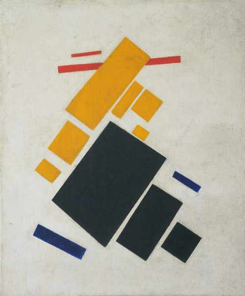
Between 1915 and the early 1920’s the Kasimir Malevich produced many Suprematist paintings. They consist of numerous abstract shapes, that appear to float in space, like slithers of paper in the wind, twisting and regrouping. They are in effect a metaphor for the excitement and optimism the revolutionaries felt about the new Soviet world they had created – a new art for a new age. If we look at these paintings literally and see just a group of shapes we miss the point.
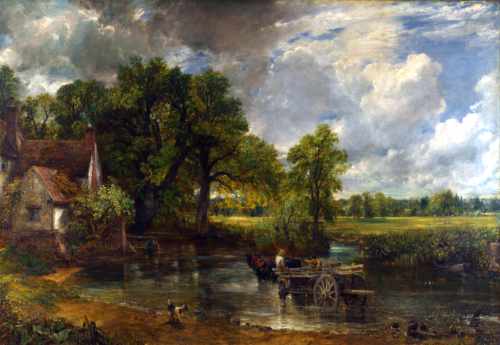
It is not just in abstract paintings that shape can be important. In Constable’s painting of The Haywain we can see a dark shape (the trees) on the left of the painting balanced by a much larger lighter shape (the sky) on the right of the painting. It can be important to reduce a painting down to its basis shapes to see how they inter-relate. This can give us an important guide to how successful the overall composition in a painting is and how a sense of balance is created, if that is what the artist is seeking to achieve.
Paul Cézanne often ‘simplified’ the objects in his paintings down to basic shapes. He did this to investigate the relationship between objects and create the illusion of space and depth in his paintings. It was this idea of simplifying objects to basic shapes that led Pablo Picasso and George Braque to experiment with shape and invent the style of painting that became Cubism.
Scale
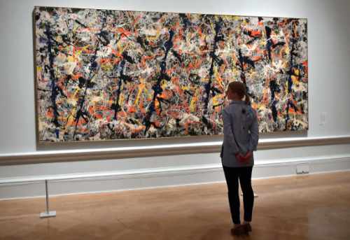
Whatever anyone says size is important! A Jackson Pollack painting needs to be huge, preferably against an even bigger white wall, so that we can appreciate the passionate and heroic nature of the piece. His rhythms and lines of paint flow in an instinctive manner, layer upon layer. They draw us into the work in a way a child could not possibly conceive of.
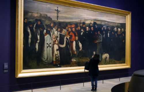
Gustave Courbet was another artist who exploited scale to make his paintings ‘work’. His painting Funeral at Ornans 1848 depicts a peasant funeral with life-size figures. Because of the sheer size of the painting (7.5m x 4m) when the viewer stands in front of the work he becomes part of what is going on in the painting. Something Napoleon III realised when he saw the painting at the opening of the Salon exhibition of 1850 in Paris. After the revolution of 1848 peasant burials in consecrated ground was illegal. For Courbet to get the Emperor to ‘attend’ the burial was seen by Napoleon III as an outrage. The painting was removed from the exhibition along with all Courbet’s work. Courbet’s reputation and his embryonic socialist ideas were greatly enhanced as a result.
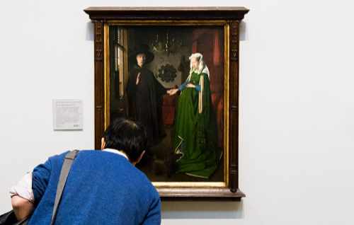
At the other extreme the small interiors of the Dutch artist Jan van Eyke would probably not work if they were larger in scale, because the organisation and intimacy would fall apart. He permeates his figures with mood that makes time seem as though it has stood still. His painting The Arnolfini Portrait 1434 is small 82cm x 60 cm. The small scale draws us into the painting, almost like a voyeur, so that we too can experience the solitude and the enigmatic human relationships.
Texture
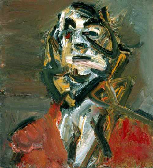
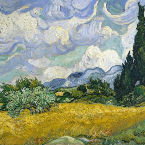
The texture of the surface of the painting, can be important, is it rough or smooth? Some artists use bold and vigorous brush strokes and thickly applied paint. This can indicate a vibrant, bold personality or give the work a dramatic impact as can be seen in the work of Frank Auerbach or Vincent Van Gogh. The bold brushstrokes become an important element in the construction of the painting. Other artists will do the complete opposite creating very smooth surfaces where brushstrokes are nor disenable.
There are lots of ways of applying paint, sometimes it is squeezed directly from the tube onto the canvas, or applied with a palette knife. These methods result in a highly textured surface that catches the light emphasising the texture. A less bold, but nevertheless effective way of applying textures with paint is to use a method called ‘scumbling’. This requires ‘dry’ paint to be dragged across an already painted surface in such a way that the under-painting shows through. The effect is like seeing a colour through a thin slither of sponge. It is particularly effective method to use on canvas where the difference between the warp and weft can be exploited.
In contrast, a method called ‘Sfumato’ smooths the edges between colours to create gradual transitions between one colour and the next and virtually eliminates the brushstrokes and therefore the texture.
Medium
The choice of medium in which a painting is produced is very important. Not only will it influence the way the painting looks, but it will also define the range of possibilities available to the artist. An artist using oil paint on canvas will be able to exploit impasto techniques (applying paint thickly to create textures) and glazes (applying paint in thin washes) whereas; the water colourist will utilize the subtleties of watercolour floated over damp paper.
The quality of marks made with these methods can vary as widely as those made by pastel, charcoal, pencil or pen. So it becomes important that the artist chooses the right medium for the work he or she intends to produce. When we look at a painting we can make judgements about how the artists has handled and exploited the medium in which he or she is working.
Medium can also refer to the liquid that is added to paints to make them act differently, for example: water, linseed oil and poppy oil, can have the effect of thinning or making the paint dry more slowly. Artists often do not restrict themselves to a single mediums as was the case in the past. They produce multi-media paintings in which a number of different mediums, and their resultant properties are exploited.
How the Elements of Form work together
If we consider the elements of Form in isolation we would be guilty of not really understanding form or how a painting is constructed. Judging colour without taking into account aspects such as line, shape, texture etc., is like assessing one footballer’s contribution in a match without considering the other players in the overall team performance. So now we have some understanding of the primary elements of form (individual players): colour, line, shape, texture etc., we need to consider the secondary aspects (the team performance). How do the primary elements interact with each other. We can do this by considering the elements of Form in terms of, composition, balance, rhythm and harmony.
Composition
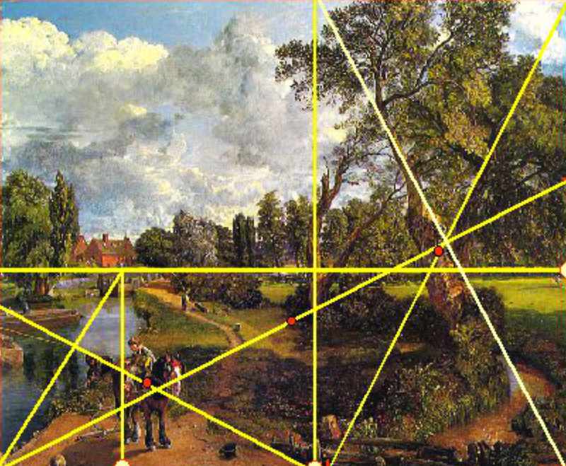
Like a piece of music, a painting has to be composed. Amateur painters often give little or no thought to composition, being instead obsessed with recording exactly what they see. Artists work differently, they tend to interpret what they see and consciously or intuitively, compose their paintings even if it means manipulating the scene or objects they are working from so that the final painting looks balanced. A good example of this is the painting, Flatford Mill 1817, by John Constable.
The painting has been composed using a compositional method called the Golden Section, which was invented by the Ancient Greeks. The whole painting, including the flow of the river and even the angle of the branches on the trees, are subjected to the constructs of the Golden Section. You will see the Golden Section influencing the composition of many paintings both old and new. It influences design in many walks of life outside of art, including architecture and even the shape of TV screens.
Angles are often important in paintings they can lead the eye in a particular direction to something the artist wants you to focus on. Or they can suggest stability when horizontal or vertical lines /elements such as trees, poles, streets etc. predominate. Stability, can be used to suggest calm or solitude.
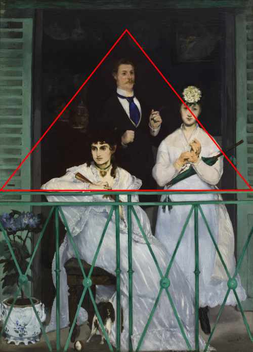
The triangle is another compositional tool used to create stability> It is often used in portraits where the head is at the apex and maybe a folded arm forms the base of the triangle. Triangles can be used to group figures often with the most important being at the apex of the triangle. A good example of this is Édouard Manet’s painting, The Balcony 1868. Religious paintings often feature Christ at the apex of the triangle, surrounded by subordinate figures at the base.
If the angled lines cross each other, this creates instability and therefore can be used by the artist to create a sense of drama, action or conflict.
In artist speak composition is the process of arranging and organising the elements of Form in order to produce a conceptual unity.
Balance
If we look at the work of the abstract painter Piet Mondrian, it will give us an understanding of what is meant by balance in art. Mondrian used very simple elements in his work; namely, horizontal and vertical lines plus black, white and the three primary colours. His aim was to create a universal perfection, an almost spiritual balance between the colours and lines.
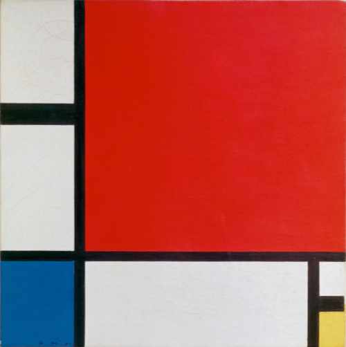
We can sense the balance in his works, because there are no objects to get in the way of our vision. The idea of balance is important in most art works, but it may be a little more obscure to appreciate. Look for a balance between light and dark, soft and hard edges, subtle variations in colours and contrasting colours etc.
Harmony
In music we often talk about creating harmony. If we hear a discordant note, it can jar. But the musician may have deliberately introduced discordant notes for a particular effect or contrast. The artist works in a similar way. Wassily Kandinsky produced paintings around 1910 inspired by music. He used colour and shape to create the visual equivalent of music, some colours and shapes harmonise, some clash and contrast. To appreciate such works stand close to them and let your mind wander. The colours and shapes will ‘float’ in front of your eyes and create a sensation much like that we get when appreciating music.
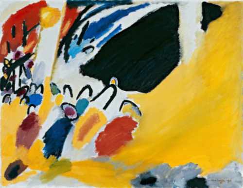
Look also for paintings in which the artist uses a colour scheme that harmonises, for example, a range of blues and greens and contrasts that with a complimentary colour – the discordant note. The contrasting colour is often used to focus our attention on a particular element within the painting, or to provide our gaze with a jolt to draw us into the picture.
Rhythm
We have all danced and watched others dancing. Some people have rhythm and some plainly haven’t. People with rhythm have a certain grace about their movements, which is appealing to our own senses. The same applies to painting. If we take Matisse’s painting, The Dance as an example, we see he has used line to suggest rhythm in the way he has drawn the dancing figures. Each one is connected, the line outlining their bodies, flows from one figure to another linking them together. He has in effect produced a visual equivalent of the movement of a real dance.
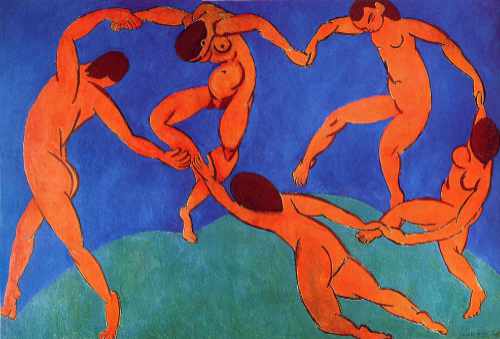
Repeating a series of increasingly curved figures across a painting, or repeating a series of colour harmonies in an abstract work, can also suggest rhythm. Obvious examples of rhythm being used to suggest movement can be found in the work of the Italian Futurist painters, such as Umberto Boccioni and Giacomo Balla.

